Global Compare Design Enhancements
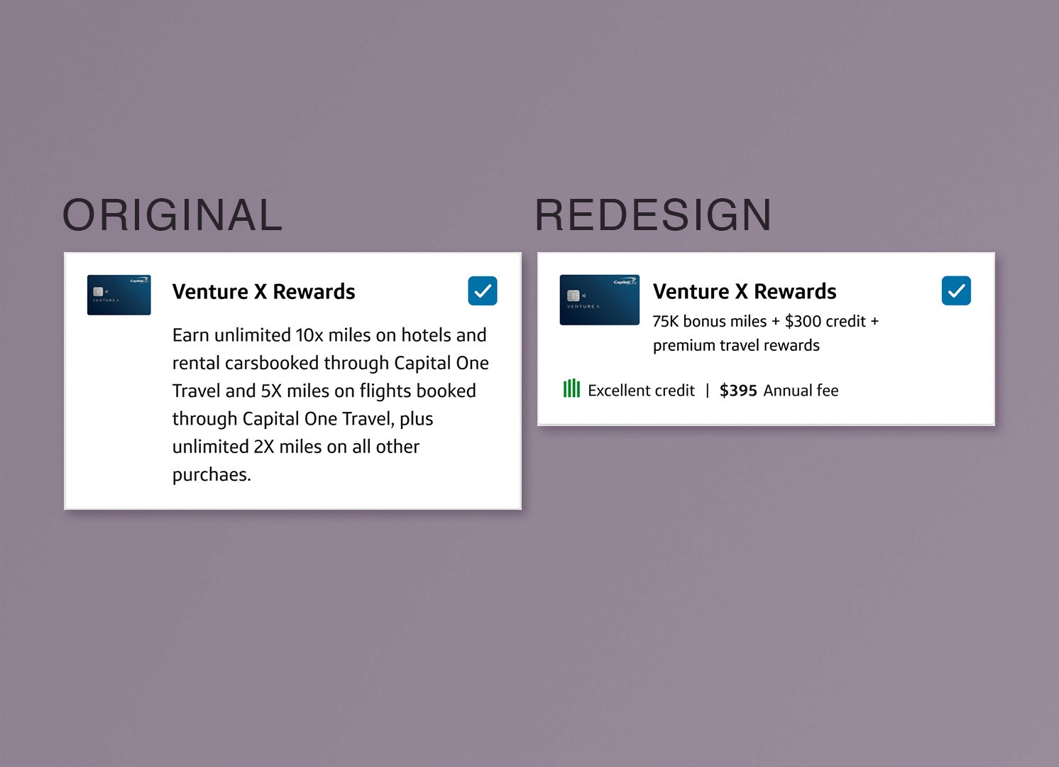
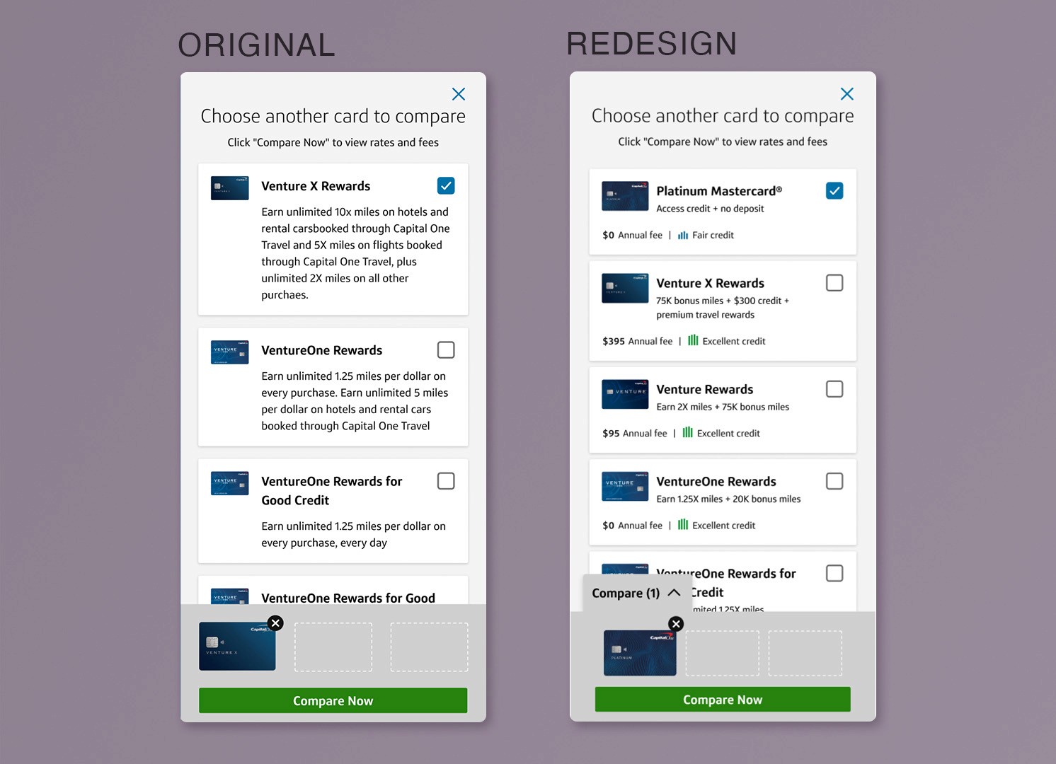
As we prepared to expand Global Compare, we identified a UX gap: while functional, the existing Compare experience didn’t prioritize key information or support quick comprehension. The design was clunky, wordy and not easily scannable–none of which aligned with the quick comparions intents of the tool.
MY CONTRIBUTION
Led a design refresh focused on clarity and usability. Reworked the modal UI to emphasize the most critical card info (based on user feedback) and improve scannability, helping users more confidently compare at a glance without getting bogged down with lengthy paragraphs.
PROCESS
Evaluated what users tend to look for early in the card shopping process, adjusted visual hierarchy based on priority, and restructured layouts to surface what matters most. Collaborated with partners to ensure these enhancements aligned with our scaling roadmap and could be implemented cleanly across test cells.
OUTCOME
The updated modal and drawer designs supported a seamless scaling effort while improving clarity for end users. Although the improved design is still in testing, the learnings will inform multiple efforts in the Capital One card portfolio and shape how we understand what users prioritize when shopping.